Pepperkorn Posted December 17, 2011 Share Posted December 17, 2011 At least DM got it right on the message board banner -- that's what really counts. The 7 had the diagonal top right corner - it's block on the banner. you get what you give Nieds - it may be half-assed but it's still awesome. Quote Link to comment Share on other sites More sharing options...
LucifersDog Posted December 18, 2011 Share Posted December 18, 2011 Maybe Vanderbeek didn't pay the bill. You get what you pay for. Quote Link to comment Share on other sites More sharing options...
BCdevil Posted December 18, 2011 Share Posted December 18, 2011 the lockout throws this into a wreck - i'm ok w/ the years. I understand that the lockout confuses things but they should at least be consistent. I would prefer that they both say 2004, for the last game played. Quote Link to comment Share on other sites More sharing options...
Guadana Posted December 18, 2011 Share Posted December 18, 2011 can you ask for me to one question? when nieder sad special thanks for lou - devils fans say booooo Quote Link to comment Share on other sites More sharing options...
The 29th Pick Posted December 18, 2011 Share Posted December 18, 2011 can you ask for me to one question? when nieder sad special thanks for lou - devils fans say booooo No no Fans Devils say Louuuuu Quote Link to comment Share on other sites More sharing options...
sundstrom Posted December 18, 2011 Author Share Posted December 18, 2011 can you ask for me to one question? when nieder sad special thanks for lou - devils fans say booooo they said "Lou" Quote Link to comment Share on other sites More sharing options...
Joe B Posted December 20, 2011 Share Posted December 20, 2011 they said "Lou" I was saying boo-urns. my seats were next to the boxes were Nieds family was. For as graceful Scotty was on the ice, he came real close to falling down as he was walking down the stairs and possibly going over the glass. Stumbled down a few stairs but regained his balance, it was just a sureal moment when I saw it. and getting back on topic since all I really wanted to do was throw in a simpsons reference is. Aren't the fonts inconsistent on a few banners? don't think it's one of the cup banners but I do remember some of the banners being off. I will have to check tonight. Joe Quote Link to comment Share on other sites More sharing options...
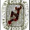
DaneykoIsGod Posted December 20, 2011 Share Posted December 20, 2011 Kinda looks like a mishmash of Christmas Tree era 2s. Take the top of this 2 ... ... and the bottom of this 2 ... ... swap black for green and bada bing bada boom, you kinda sorta end up with this bastardized 2 ... Makes perfect sense. Quote Link to comment Share on other sites More sharing options...
DevsMan84 Posted December 20, 2011 Share Posted December 20, 2011 Kinda looks like a mishmash of Christmas Tree era 2s. Take the top of this 2 ... Makes perfect sense. Could be since Niedermayer did get drafted when they wore the old jerseys. Am I the only one who is most annoyed about the "R" in his name? I do not think they used that font at any point. Quote Link to comment Share on other sites More sharing options...
Quinn01 Posted December 20, 2011 Share Posted December 20, 2011 Could be since Niedermayer did get drafted when they wore the old jerseys. Am I the only one who is most annoyed about the "R" in his name? I do not think they used that font at any point. Damn it stop pointing these things out! Now I wont be able to look at the banner! Quote Link to comment Share on other sites More sharing options...
sundstrom Posted December 20, 2011 Author Share Posted December 20, 2011 Could be since Niedermayer did get drafted when they wore the old jerseys. Am I the only one who is most annoyed about the "R" in his name? I do not think they used that font at any point. wow - missed the R - yup another terrible job there. the 2, i suppose, could be like the kitchen jersey but it's still wrong in my eyes. they might as well have done the rangers 3d font Quote Link to comment Share on other sites More sharing options...
Colorado Rockies 1976 Posted December 20, 2011 Share Posted December 20, 2011 Funny DIG, I remember thinking the same thing, that it reminded me of the second Xmas font. The first Xmas one was kinda weird looking...the numbers were too skinny. When you watch old Devils videos, those numbers just look primitive somehow. Still can't believe the fonts are so off...especially when Stevens and Daneyko were correct. Gotta think the manufacturer blew that one... Quote Link to comment Share on other sites More sharing options...
devilsfan26 Posted December 21, 2011 Share Posted December 21, 2011 Aren't the fonts inconsistent on a few banners? don't think it's one of the cup banners but I do remember some of the banners being off. I will have to check tonight. Joe They may be, but this is a glaring error because in this case there is an actual correct font--the one used on the jerseys. The Stevens and Daneyko banners have the correct font, but the Niedermayer one does not. Quote Link to comment Share on other sites More sharing options...
MadDog2020 Posted December 21, 2011 Share Posted December 21, 2011 Does anyone think they'll replace the banner, or just leave it as is? I'd imagine it wouldn't be a cheap endevor. Quote Link to comment Share on other sites More sharing options...
Colorado Rockies 1976 Posted December 21, 2011 Share Posted December 21, 2011 Does anyone think they'll replace the banner, or just leave it as is? I'd imagine it wouldn't be a cheap endevor. I really do think the banner company f'ed up, and that there simply wasn't time to replace it. I just find it hard to believe that the Devils would screw something like that up...why would they ever send the wrong fonts over to the company that manufactured the banner? Especially when they were correct on the mini-banner and print? If that's the case, I would think it's on the manufacturer to replace it free-of-charge, as it was their screw-up to begin with. Quote Link to comment Share on other sites More sharing options...
DaneykoIsGod Posted December 21, 2011 Share Posted December 21, 2011 I'm guessing that having had four days since Nieds Night, they moved the banner(s) down to their permanent spot next to 4 and 3. Can anyone who was there last night verify? How'd they look all together? I'm kinda surprised I haven't seen any pics of them yet. Quote Link to comment Share on other sites More sharing options...
thelastonealive Posted December 21, 2011 Share Posted December 21, 2011 (edited) A friend of mine posted a photo of all three together on her Facebook, looks good. Font still looks wonky, but I'm wondering...could the weird font be because his name's too damn long to fit comfortably on the banner with the regular font? Would explain the weird looking R's anyway (though it offers no explanation for the weird 2). I don't know why, but I'm surprised by the placement of the banners. It goes Neidermayer/Danyeko/Stevens. I would have thought Neids would be at the other end, in number order. I dunno why I notice these things, just...stuck me as a little odd. I'm sure there's a perfectly good reason for the order (probably a pain in the ass to move the other banners over or something). Edited December 21, 2011 by thelastonealive Quote Link to comment Share on other sites More sharing options...
DaneykoIsGod Posted December 21, 2011 Share Posted December 21, 2011 I don't know why, but I'm surprised by the placement of the banners. It goes Neidermayer/Danyeko/Stevens. I would have thought Neids would be at the other end, in number order. I dunno why I notice these things, just...stuck me as a little odd. I'm sure there's a perfectly good reason for the order (probably a pain in the ass to move the other banners over or something). I think it's just the order in which they were retired ... Stevens, Dano, Nieds. I think Monument Park in Yankee Stadium is ordered in the same manner. Quote Link to comment Share on other sites More sharing options...
sundstrom Posted December 21, 2011 Author Share Posted December 21, 2011 I'm guessing that having had four days since Nieds Night, they moved the banner(s) down to their permanent spot next to 4 and 3. Can anyone who was there last night verify? How'd they look all together? I'm kinda surprised I haven't seen any pics of them yet. they look fine - other than Nieds being wrong as has been discussed. i have a feeling they'll never change it. I think it's just the order in which they were retired ... Stevens, Dano, Nieds. I think Monument Park in Yankee Stadium is ordered in the same manner. correct. Quote Link to comment Share on other sites More sharing options...
thelastonealive Posted December 21, 2011 Share Posted December 21, 2011 I think it's just the order in which they were retired ... Stevens, Dano, Nieds. I think Monument Park in Yankee Stadium is ordered in the same manner. Ah, makes sense. And I wouldn't know about that Yankee crap. Quote Link to comment Share on other sites More sharing options...
Matteau#32 Posted December 21, 2011 Share Posted December 21, 2011 Well I see someone else shares the OCD gene When I saw highlights of the ceremony, I noticed it, too. Quote Link to comment Share on other sites More sharing options...
DaneykoIsGod Posted December 21, 2011 Share Posted December 21, 2011 Ah, makes sense. And I wouldn't know about that Yankee crap. Speaking of "that Yankee crap" ( ) and retired numbers, I always thought it was a cool coincidence that both franchises retired the same first two numbers in the same order: Gehrig & Ruth, Stevens & Daneyko. Quote Link to comment Share on other sites More sharing options...
DaneykoIsGod Posted December 21, 2011 Share Posted December 21, 2011 (edited) UniWatch made mention ... Devil is in the details: After the Devils retired Scott Niedermayer’s number the other day, several readers pointed out that the numerals on his banner didn’t match the team’s jersey number font. According to reader Steven Wojtowicz, this is just the latest manifestation of a trope that’s been driving him bonkers for years (and will probably start driving the rest of us bonkers now that he’s pointed it out): The 7 that the Devils use for retail purposes is different than the 7 that the players wear on the ice.Odd, right? I’ll make some inquiries and see what I can find out. Never noticed the 7 thing before, but it's dead on. The image provided does a decent job of showing the difference in the top right corner of the 7, but because Kovy tucks his jersey it doesn't really clearly show just how different the bottom is. This one is a little clearer. The bottom part on the retail jersey doesn't end nearly as far to the left as the game-worn ones do. So 7 on the Nieds banner is actually closer to what he wore in his playing days than the the one on the sweaters they gave him at the ceremony -- both the framed one and the one he wore. The 7s on the mini-banners, the podium, all over the arena ... all wrong as well. Edited December 21, 2011 by DaneykoIsGod Quote Link to comment Share on other sites More sharing options...
Jimmy Leeds Posted December 22, 2011 Share Posted December 22, 2011 When I saw highlights of the ceremony, I noticed it, too. Did you notice the lack of a blubbering fool at center ice glomming for the spotlight? Quote Link to comment Share on other sites More sharing options...
Matteau#32 Posted December 22, 2011 Share Posted December 22, 2011 Not about the banner, but question about something Doc said during the ceremony. Niedermayer won the Stanley Cup, World Cup, Memorial Cup, Olympic Gold, and World Jr Gold. Doc said he is the only player to win all 5. Was it just those 5, or was their a 6th Championship in that mix that I missed? Quote Link to comment Share on other sites More sharing options...

Recommended Posts
Join the conversation
You can post now and register later. If you have an account, sign in now to post with your account.