Leaderboard
.thumb.jpg.26ae89b3ead838759ace1f91bf1d31cf.jpg)
Popular Content
Showing content with the highest reputation on 11/24/2021 in Posts
-
Great to see...5 points
-
White.. black.. red.. green.. old logo.. new logo.. alternate logo.. past.. present.. future.. good times.. bad times.. Mickey.. Marty..…………. devils ❤️
 4 points
 -
What a sh!t article... "going with the more familiar/colloquial “Jersey” is a good choice that likely will have pop culture ramifications when celebrities from New Jersey embrace this new design." Lmfao fvck outta here with this nonsense. Like this jersey is somehow gonna have a bigger pop culture reference than the old jerseys had.4 points
-
He brings a physicality that we have somewhat lacked with Wood being out.3 points
-
Maybe it would wake McLeod up. He was a heck of a bottom 6 player last year and this year not so much.3 points
-
Zakhar Bardakov did score in his second VHL(russian AHL analog) game. 2 games 1g 1a after that SKA give him an opportunity in KHL and he scores and made 2 assists. TOI 14:07, 3 hit.3 points
-
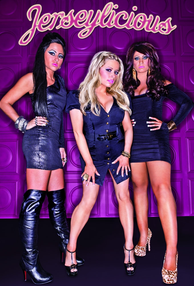
They should have put Jerseylicious on the jerseys.2 points
-
Why would you not take him back? Bin off Geertsen.2 points
-
I would take him back.2 points
-
Ugh they do, they are just so disappointing2 points
-
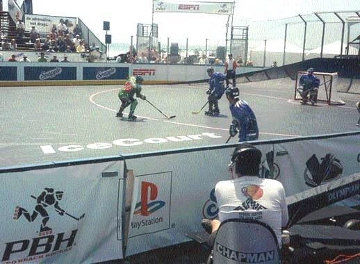
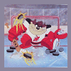
I remember a few were on the old SportsChannel and my 13-14 year old self thought it was great. High scoring from what I recall. I have no idea what I would think of it these days. Hey…. Speaking of this roller hockey, does anyone remember Pro Beach Hockey? The 90s were fun
2 points
-
At least we don't have a cat butt on our jersey2 points
-
And they’ll pay homage to “famous” historic Colorado teams, such as the Denver Invaders and the Rocky Mountain Rage.2 points
-
It’s gonna be purple and green with ‘Rado in block letters on the front.2 points
-
Maybe a single stripe per sleeve…one for each road win…2 points
-
https://thehockeynews.com/news/applaud-the-devils-for-trying-something-different-with-new-jersey?fbclid=IwAR0HyQ73u5y5wqus8OkPGB07RDJDVwm-NLQxtG-rMjoKU1QiWH8DRuc2jSA2 points
-
That would fvck up conference balance though. As much as I’d love a Nordiques return, the league is better off moving Arizona to Houston. Huge untapped market, plus a natural rivalry with Dallas.2 points
-
Another one...
1 point
-
I'll take a black Jersey personally. I know it's tough and I know a lot of people, just in general have a hard time accepting change. Change can be a good thing. If you don't like it don't buy it.1 point
-
Still really good at face-offs though.1 point
-
Wonder if we’ll submit a claim…..1 point
-
Everyone is getting in on it...1 point
-
It was fun and cheap. Since I lived about 10 minutes away from the sports complex no hassle to get to. The kids seemed to like it. Lime green with a musical staff and a guy in sunglasses playing a guitar, how did the Devils miss incorporating those features into the their "Jersey" Jersey?😎1 point
-
i'm a little late in responding to this. I actually had season tickets to the Rock N Rollers.😮 I remember one game had to be cancelled because the floor was still wet after they melted the ice from the last game of the Stanley Cup finals.1 point
-
Nothing i could say will make you love it if you don't. However, if you bring up technical aspects saying that it's wrong or amateur because there's breaks, that i will step in and point out that it's totally fine and often necessary to have breaks between letters when using a script font cause depending on the letters being next to each other it might make it harder to read or confusing. Depending on the font, an n may look like an m if there's 2 in a row or 2 n may look like a w or just look weird. An o and and l may look like a d, etc etc So as a designer you have to look at the letters and make creative decisions to make sure it's easy to read. So you might have to tweak things or have breaks here and here. Also as a major rule the capital letter very very very rarely connected with the rest of the word. You also don't have to trust what im saying but just off the top of my head just look at the Fender logo, look at the Kellogg's logo, Ray Ban, Nicole Miller, Sharpie. In all those ones, if you'd connect all the letters it would look weird. And also the capital letter is not connected to the rest in any of them. Well I do have an opinion but i don't believe my professional credentials would/should have any sort of impact on anyone's opinion. On top of design/art being highly subjective, we live in a world where people will simply believe what they want to believe literally no matter what, even in somewhat objective fields where professionals are not always seeing eye to eye on subjects. People will just trust the one professional that happens to align with what they want to believe haha You just know that everywhere there's biased mechanics pushing their personal "GM vs Ford" bullsh!t opinions on their clients haha I personally think there's nothing objectively ugly on that jersey, there's also nothing objectively creative about it, but looks like its not what they were going for. Most criticism comes from people not getting what they wanted, mostly, and it's not that unfair either. We all feel like most fan concepts we've seen through the years would have been great. I think we're the only 2 guys who kind of like or at least don't mind the new jersey. If this was our new official jersey i'd be upset cause it would take over the other one with something i feel is subpar, but this is an alternate that they'll only wear a few times, so i just don't care that much, every teams is dealing with this. Like everyone i prefer the one you did or just about any of the black concepts ive seen. But this is what we got.1 point
-
At least they played in Brendan Byrne Arena and in some of our lifetimes!1 point
-
Move Florida to Houston, Arizona to Quebec City, problem solved.1 point
-
I just hope we don’t forget the NJ Rock N Rollers when designing the next jersey 🤣1 point
-
The whole Seaside Heights souvenir look is really the script font used for "Jersey". Say what you want about Schiano as a football coach, he canned the elaborate 18th century script R for the block serif you see on bumper stickers today. That soft curvy font is totally forgettable. It does not even whisper HOCKEY, let alone NEW JERSEY. Heck,I talked to a visual artist about the font I use to present financial statements to clients. Fonts are same as the tone in your voice when you say something. And that font says....Nada. Nil, Zilch, Wimp. It doesn't say "New Jersey, Where the Weak are Killed and Eaten". That's what I want from a font on a New Jersey hockey jersey.1 point
-
Do their strips also represent the 21 counties?1 point
-
Hmmmm....
1 point
-
Sounds like a team we should really dedicate stuff to on our current jerseys!1 point
-
But they could have tried to please one person at least lol.1 point
-
That's 100% correct. The NHL apparently told them that they need to consider our fanbase like an original 6 franchise and that changing the logo would not go over well. Can you imagine if they ignored the league and went with that cartoon character logo? That would be 100x better than what they rolled out.1 point
-
True but sends a message to the AHL guys that you will get rewarded. 14 wins in a row you kindve have to show them some love.1 point
-
1 point
-
Well some good news on this front. Hughes is back at practice today but in a no-contact jersey and doing limited participation.1 point
-
They look like t-shirts 🤣0 points
-
That would be easy, Devils jersey, Rockies colors, or Rockies jersey, Devils colors.0 points